Visualising Data with Microsoft Power BI
Blog|by Jamie Maguire|4 December 2018

Introduction
In some of my previous blog posts, we looked at some of the rich functionality offered by Microsoft Cognitive Services and touched on how Cognitive Services can be used to help find insights in social media data.
Processing social media data, or any other type of data for that matter, often can involve hundreds, thousands or even millions of records!
Information tells a story and that story can be made much easier for others to understand if it’s presented in intuitive formats such as graphical visualisations, and this is where Power BI comes in!
What is Power BI?
Microsoft Power BI (Business Intelligence) is an analytics service that lets you transform data into rich visualisations that can be shared with colleagues and viewed on multiple devices.
It can be run on-premise, using Power BI Report Service behind your firewall; in the cloud, hosted by Microsoft; or run on your desktop using Power BI Desktop.
Whether you’re an analyst, developer or run an IT Department, Power BI’s visualisations helps you see the bigger picture, unlock key business insights, make better informed decisions and track trends over time.
Aston Martin
Aston Martin uses Power BI dashboards to help the quality car firm get a handle on its data. Neil Jarvis, the Director of IT and Security at Aston Martin says, “The simplicity of the dashboards and the richness of the data is generating interest across the company.”
Rolls Royce
Rolls-Royce deployed Power BI to help the firm quickly create reports and dashboards using out of the box functionality to help the engine maker reduce product development time while at the same time, help Rolls-Royce’s business customers understand the importance that data analytics can have to a project.
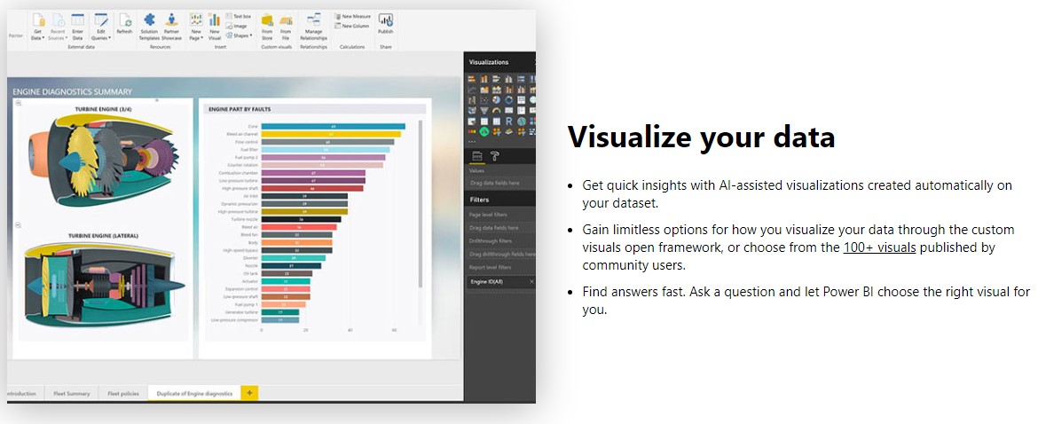
Source: Microsoft
These are just a few of the companies that are using Power BI to help them surface actionable insights in their data and improve their business processes. You can find out more about real life deployments of Power BI from firms such as BP and Qantas here.
Data Visualisations and the Development Community
The number and types of visualisations you can create with Power BI are almost infinite (if you factor in custom visualisations!), the good news is you don’t need to create your own from scratch. You can use out-of-the box visualisations such as KPI dashboards, pie charts, cluster maps, Venn Diagrams and much more. There’s also a vibrant marketplace where you can download pre-built visualisations for free!
Developers
The development community hasn’t been left behind either, the BI and analytics from Power BI can be customised, augmented and even embedded in applications using the Power BI SDK. Using the SDK and REST APIs, developers can embed rich visualisations in web applications, SharePoint or Microsoft Teams.
Fully customised data visualisations can also be created using the open source SDK (which is based on libraries like D3 and jQuery), all of which gives developers total flexibility as to the types of visualisations they can build.
Creating a Visualisation – an example
Now we’ve covered the introduction and overview, let’s look at an example of building a visualisation in Power BI. In this example, I’m using Power BI Desktop which you can download from here. At a high level, the main steps involve:
- Connecting to a data source
- Transforming and cleaning the data
- Creating a data model
- Build the visualisations and reports
In terms of the actual data source, I’m using an extract of Twitter data I extracted using the Twitter Premium APIs as part of a research project that I’ve been working on with a university in North America, but you can use any data source that you might have to hand. If you have some key metrics that have an associated “date created” field you’ll be good to go!
For simplicity, this data has been exported from a database to a CSV file, but it contains key metrics such as the volume of retweet, Replies and Likes. You can see an example of this dataset in the image below:

Connecting to the data source
The first step is to connect to the data source – in this case the CSV file. You do this by selecting Get Data, then by selecting the relevant option from the menu (Text/CSV). After doing this, you’re presented with a file dialogue which lets you browse to the file. After selecting the file, Power BI will connect to the data source and display a preview of the data for you like this:
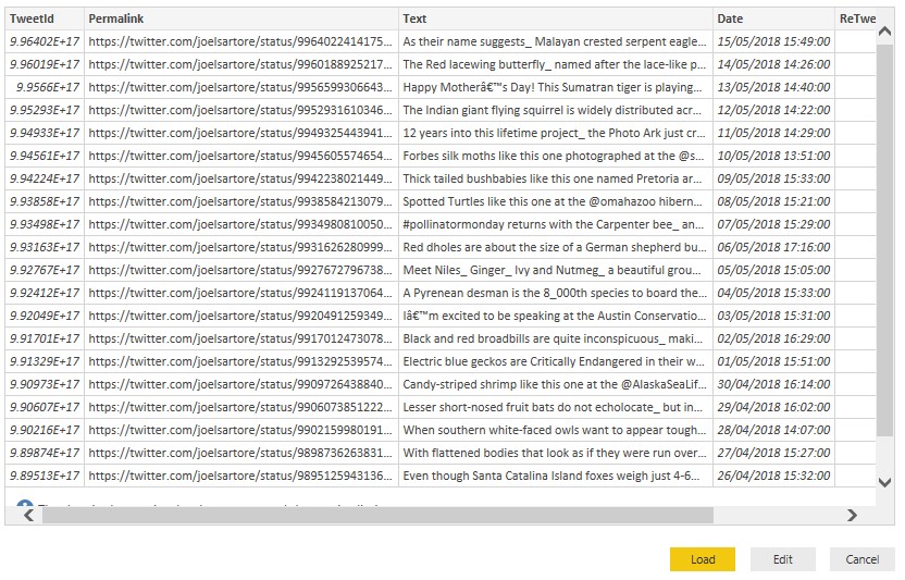
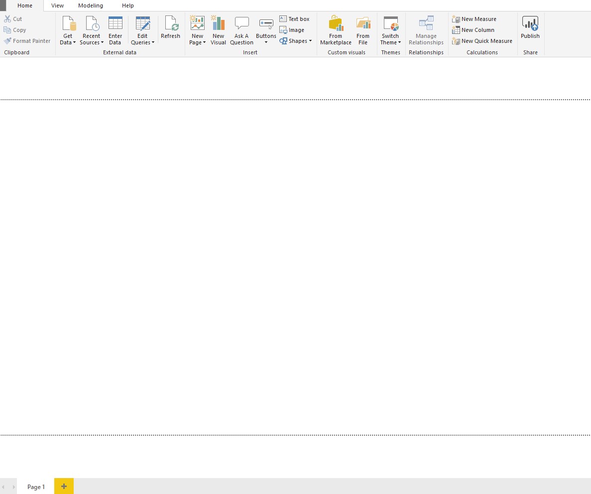
From here you can either Load the data, Edit the underlying Query that is returning the data or Cancel the operation altogether. We want to Load the data, so select that option. After Power BI has ingested the data, you’ll be presented with what looks like a blank canvas:
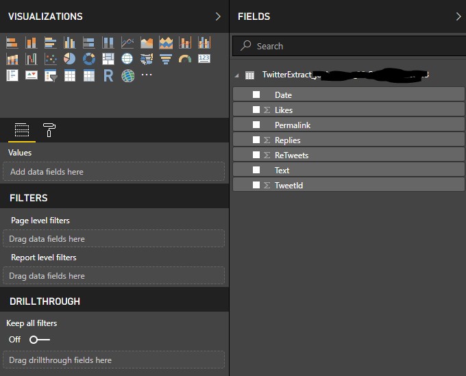
Towards the right hand-side however, you’ll find a toolbox that contains the following
- Visualisations
- Fields
- Filters
Selecting Data
Click on the “Likes” and “Retweets” checkboxes, Power BI will process the selections and display the total number of likes and retweets:
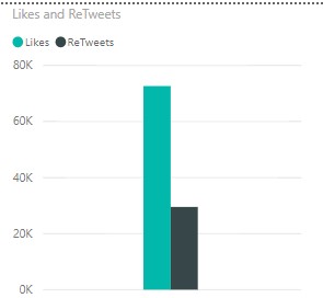
It would be nice to plot this over a given timeframe, Power BI also makes that easy! From the Visualizations toolbox, select the Line Chart widget:
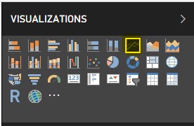
This will then create an empty widget on your Power BI canvas like below:

We need to define which fields the Line Chart widget should use. Make sure the Line Chart widget is active, and from the Fields Menu check the following check boxes:
- Date
- Likes
- Retweets
Power BI will then refresh the canvas and displays “Likes and retweets by Year”:

It doesn’t end there though, you can drill down into the detail of the Line Chart at multiple levels by clicking on the double arrows in the top right-hand corner of the widget! I’ve clicked on it once which has displayed “Likes and retweets by Quarter”:

A further click displays “Likes and Retweets by Month”:

Here we can see that June is the lowest possible month for engagement in terms of Likes for this social media account, less than half of the more popular months. Maybe more tweets need to be published in June or maybe less people are on Twitter due to holidays. Whatever the case, Power BI has made it easy to surface this insight.
This could potentially help inform the social media strategy for this account and we’ve been able to do this without having to write any SQL queries or manually process data manually!
We’ve just added a few different types of visualisations to our model, a collection of visualisations is known as a Report. A Report, just like an Excel Spreadsheet, can have multiple pages. For example, in the screenshot below, I’ve added a second tab called “Facebook Dashboard”, and if you’re interested, Microsoft have a Facebook Analytics tutorial you can check out here.

Sharing Your Visualisations
After you’ve created your visualisations you can share them with other users that have a Power BI license. Publishing your Report is straight forward, you do this by clicking on the Publish Icon from the Ribbon menu:

Source: Microsoft
After clicking “Publish”, Power BI Desktop will connect the Power Bi Service using the Power BI account that you created during the download/installation process. It’ll ask you where you would like to share your report, select My Workspace:
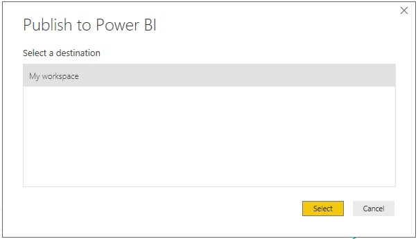
Source: Microsoft
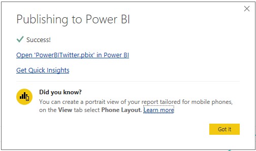
If everything has been successful, you’ll see the following dialogue:
Note: the name in the first link (PowerBITwitter.pbix) may be different and depends on the name you’ve given your report.
Source: Microsoft
Click on the “Open” link, Power BI will launch your web browser and display your Report and visualisation!
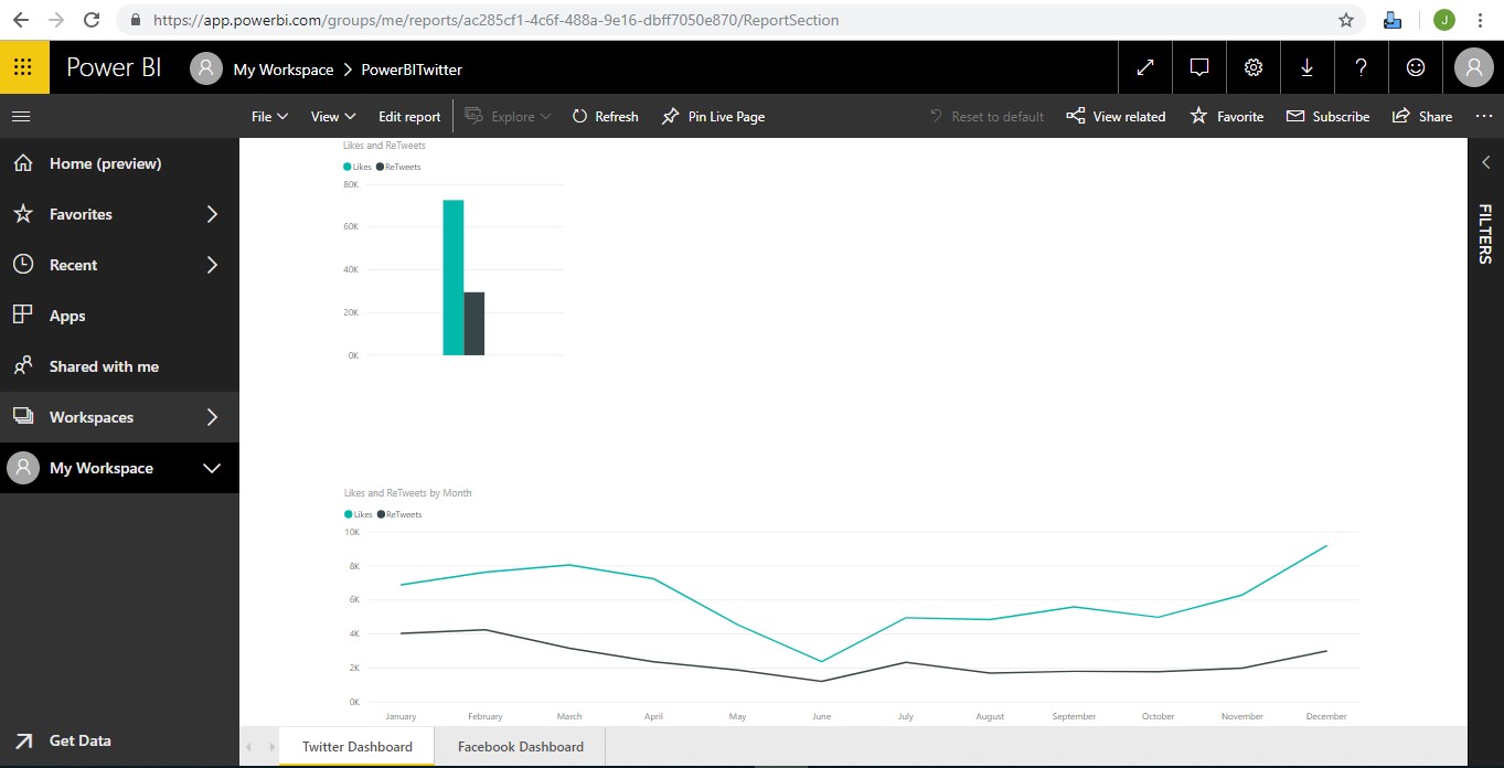
From this web page, you can perform many tasks, some of which include, but are not limited to:
- saving a copy of the report
- print the report
- export the report to PowerPoint,
- download the raw report file,
- sharing the report
- …and much more!
You can also edit the report through the web browser by clicking Edit, at which point, the visualisations toolbox will be activated in the web browser which then allows you to configure the fields and visualisations that get rendered in the report (just like we did when initially configuring the report using the desktop client).
Campaign and Brand Management
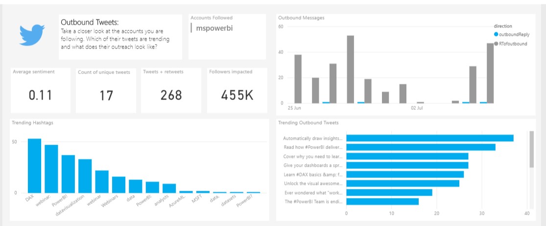
We’ve just ran through connecting to a data source, building a visualisation and publishing it. As I mentioned earlier, the Power BI community contains lots of free resources to help get you up and running quickly, and while we’re on the subject of Twitter data, Microsoft has published a fantastic Twitter Brand Management Dashboard for Power BI for FREE, you can download it here.
It contains a wide range of functionality that helps give you quick insights into how your social media message is being perceived online and includes many valuable metrics that include things like sentiment, the number of unique tweets, retweets, followers your campaign has impacted, popular hashtags and much more. You can see an example of this in the screen shot below:
Source: Microsoft
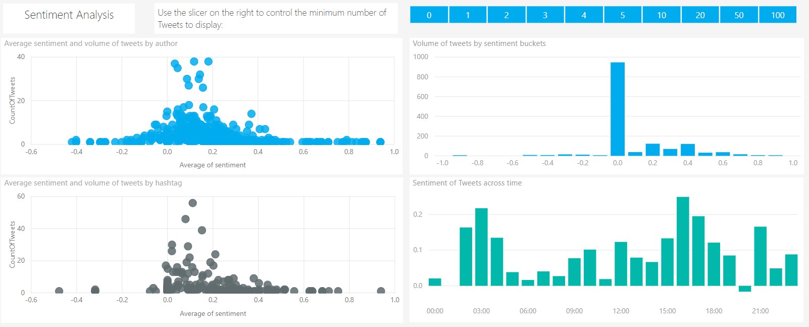
You can even drill down into the sentiment of tweets over a given timeframe, group the average sentiment and volume of tweets per author and much more:
Source: Microsoft
There’s no reason why you couldn’t build a Windows Service and integrate the Cognitive Services APIs to then automatically process incoming data from other data sources and display it in a similar dashboard. Food for thought!
Summary
In this blog post we’ve looked at Microsoft Power BI, we’ve seen how easy it is to connect to data sources and build visualisations. We’ve also seen how easy it is to publish and share your reports online and looked at some of the great Power BI templates that are available for free.
Are you using Power BI?
Contact Grey Matter
If you have any questions or want some extra information, complete the form below and one of the team will be in touch ASAP. If you have a specific use case, please let us know and we'll help you find the right solution faster.
By submitting this form you are agreeing to our Privacy Policy and Website Terms of Use.
Author
Jamie Maguire
Software Architect at Microsoft for Startups
Jamie is one of our Vendor Marketing Manager, specialising in mapping. He oversees several key vendors, including HERE Technologies, Azure Maps, TomTom and Adobe. During his time as a Marketing Manager across diverse roles, he's specialised in crafting compelling stories, leveraging digital tools for maximum impact.
Related News
Five insights to strengthen your DevSecOps strategy
Security isn’t an add-on. It’s an integral part of how you build, test, and deliver software. That’s what’s at the heart of DevSecOps – and why it matters for every modern development team. In season three of Grey Matter Talks Tech, we sat down with Richard Fennell, CTO at Black Marble,...
HERE Tour Planning for festive freight
HERE Tour Planning for festive freight turns multi‑vehicle chaos into efficient, on‑time deliveries with fewer miles and happier drivers.
SQL Server 2025 lands early on CSP – get ready to move fast
SQL Server 2025 is available earlier than expected. CSP Partners can start purchasing from 17 December 2025, rather than having to wait until January 2026
Smarter routing for festive freight with HERE Routing
Smarter routing with HERE keeps festive deliveries on time despite traffic, weather, and road chaos.