
Data visualisation in seconds: the power of Microsoft Bing Maps in Excel
Blog|19 July 2019

It can sometimes be difficult to see the impact of business figures and statistics. Rows and columns of data can be hard to follow, digest and analyse within a short frame of time, such as in meetings and business decision making processes. This is why data visualisation is one of the most powerful assets to have at your disposal, and the solution to achieving it in a quick and easy way is hiding in plain sight: inserting a Bing Map into your Excel spreadsheet to really get the most out of your data.
Where to start?
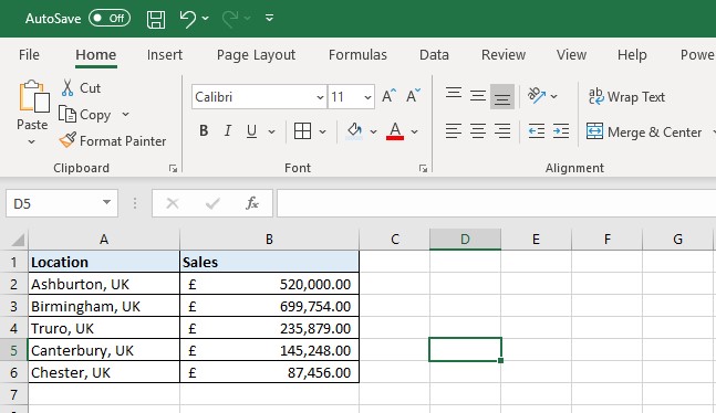
Below, I have placed some sample data into Excel based upon locations and sales in those particular areas. For the purpose of this exercise, my sample is quite small, but were I to have 100 or more entries for example, the numbers would be a lot harder to analyse in a short space of time.
Embedding the map
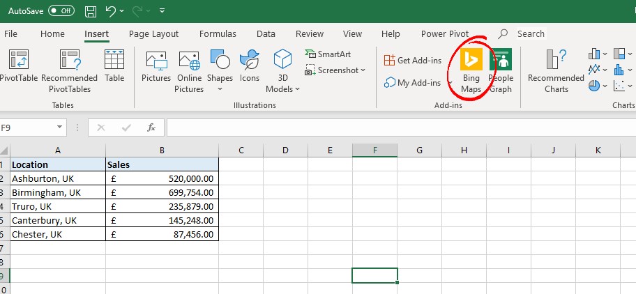
From here, all we need to do is go to the ‘Insert’ tab, and then click on the ‘Bing Maps’ icon on the ribbon as you can see below:
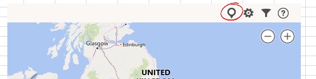
When I do that, I get a window with a Bing Map show up, but it doesn’t have any of my data on it yet! To add my data from my sheet, all I need to do is highlight it and then select the pushpin in the Bing Maps window:
Now my data has been populated into the Bing Map, and looks something like this:
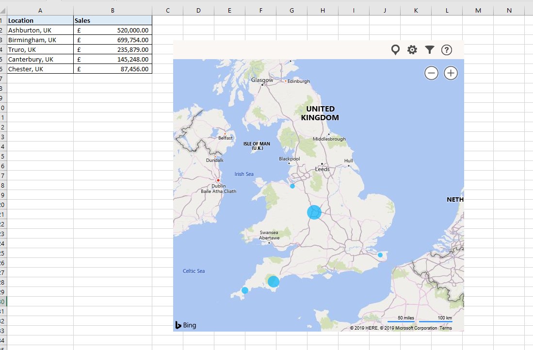
If you notice, the circles on the map are varying sizes, dependent upon the amount of sales generated in each location. Already, visualisation of our data becomes easier, for example we can see that our location on the East coast, Canterbury, is not performing as well as our locations in the West.
You also have various customisation tools at your disposal on the map: in the Settings menu (that looks like a gear) you can change the map from a road level map to a satellite image, change the colour of the pushpins and more, and using the Filter button you can filter the results you wish to show.
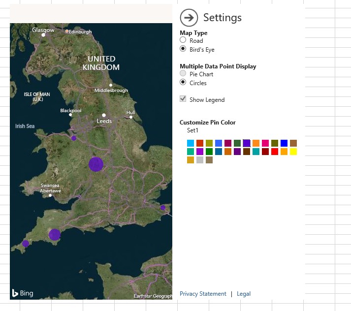
But what happens if I want to show more data?
We can also add extra granularity to our data displayed on the map too. For example, what if I wanted to show my sales by department?
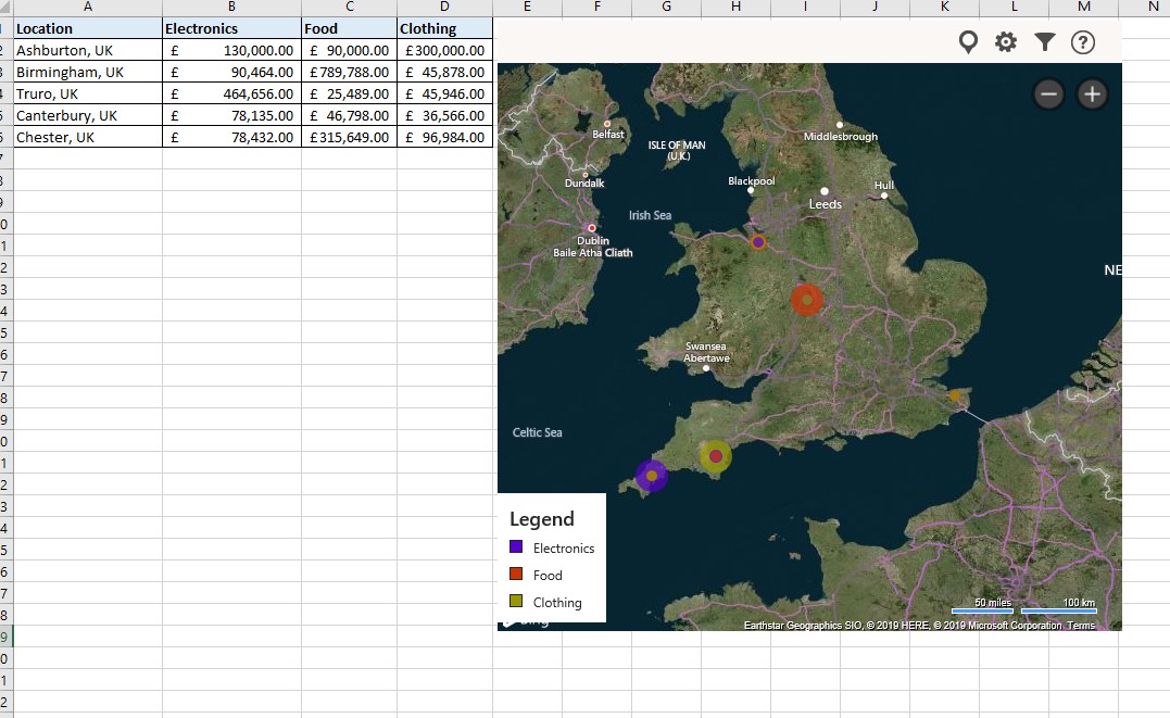
As you can see, the pushpins have changed. Now they show concentric circles in different colours, representing the amount sold for each department (electronics, food and clothing). From here we can start to make even more insights, such as which areas are performing well and in what sectors, and where certain locations are falling behind the others.
Want to see the numbers on the map? Then click on each pushpin to get a description:
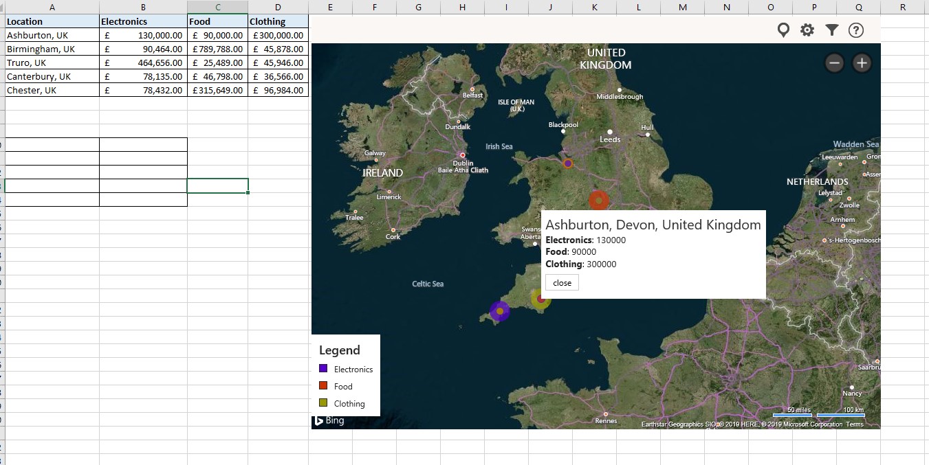
It’s as simple as that: in less than 5 minutes I have turned my data into an easy to understand format, and unlocked insights on location intelligence too!
Data visualisation across the Microsoft stack
It’s not just Excel in which Bing Maps can be used to provide insights such as these. Bing Maps integration is incredibly simple across a range of Microsoft applications, and can provide even more detailed insights. For example, through simply inputting your Bing Maps key into Dynamics CRM, you can carry out a range of activities, from displaying customer addresses, to mapping sales performance with heatmaps, and in Power BI you can add location intelligence to your business insights.
If this has interested you to know more about how Bing Maps can enhance data visualisation and how it can complement the Microsoft stack, then reach out to the Bing Maps team who can discuss your use case with you and help you get set up with a key: [email protected].